Luscious Lips in Photoshop
Luscious Lips in Photoshop
Happy with our training?
For more tutorials, head to http://photoshopetutorials.blogspot.com/
Give your lips a sexy look!
Music: Kevin MacLeod
Luscious Lips in Photoshop
Happy with our training?
For more tutorials, head to http://photoshopetutorials.blogspot.com/
Give your lips a sexy look!
Music: Kevin MacLeod
Easily use Photoshop to change the color of someone's eye!Awesome Eyes in Photoshop
For more tutorials, head to http://photoshopetutorials.blogspot.com/
Music: Kevin MacLeodCategory:
Build a complete website design mockup for a fictional design studio, starting with the creation of the initial layout then moving on to designing the individual page elements. The result is a modern, crisp and clean webpage layout ready for coding.
Taking inspiration from various modern website designs, we’ll produce this clean and crisp website layout. Key features include horizontal bands to separate the content into specific areas; a colourful header area introducing the site; a friendly welcome message with examples of work; two-column main layout and a resource filled footer.
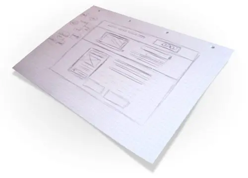
A good start with any design is to sketch out the plans on paper, the free reign of the pencil helps flesh out the rough layout with ease.

Planning out a wireframe also helps develop a hierarchy and gives an insight into the best positions for key elements of the design.
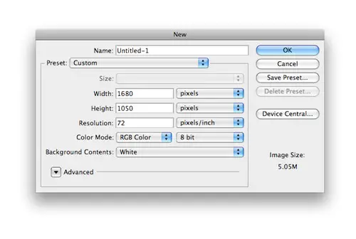
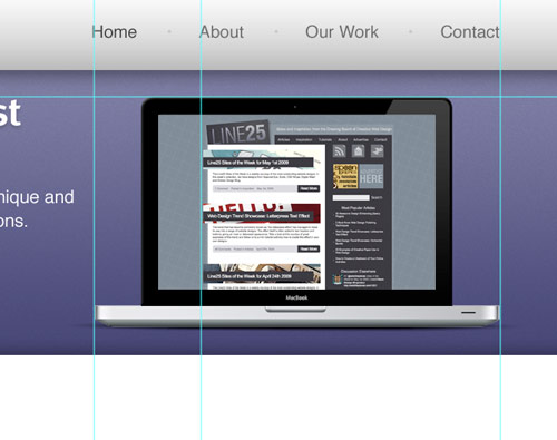
Create a new document in Adobe Photoshop, I tend to make the size of the artwork similar to that of a common widescreen monitor to give a good representation of the overall look of the site.
Place guides at a 960px width in the centre of the document and create a basic grid to place the page items against.
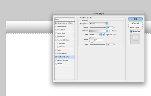
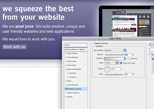
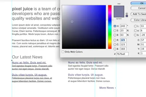
Begin with the creation of the header bar. Draw a selection across the full width of the document and fill with white. Double click the layer to open the layer styles and add a Gradient Overlay from grey to white running vertically.
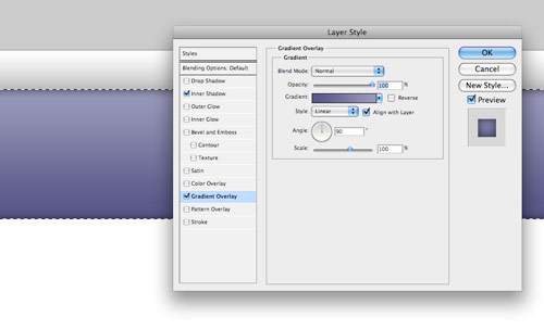
Next, draw the main header area where the featured content will be placed. On a new layer draw a selection, then add a gradient overlay with a selection of two vibrant colours. Also add a subtle inner shadow to add depth to the design.
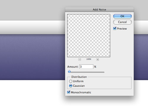
Subtle touches of texture can really bring a design to life. With the header area selected with a mask press CMD+SHIFT+C to Copy Merged, then paste on a new layer. Go to Filter > Noise > Add Noise to produce a simple texture, then set the blending mode to Multiply and reduce the opacity to suit.
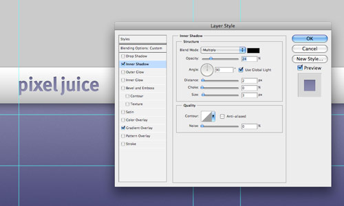
Paste in the company logo, position on screen according to the grid, then add some styling through the layer style options. Add a gradient overlay to match the feature header colours, then create a very soft inner shadow.
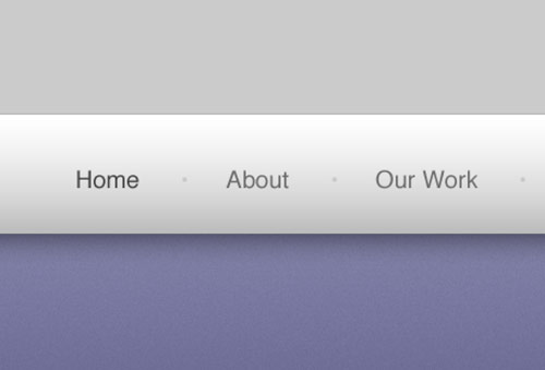
Use the Type tool to create the text of the main navigation, set the type in a mid-grey while using a slightly darker version for the active link.
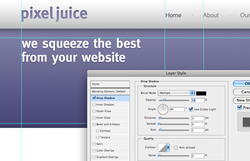
The feature header is a great place to introduce the website, with the vibrant background colour it is given main focus to the user. Use this space to place a snappy intro title in a custom font that matches the company branding.
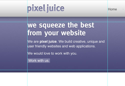
Continue fleshing out the introductory content, but this time use Arial or Helvetica as the font so that the text can be set in plain old html, without any image replacement techniques.
Position a laptop into the featured area (a range of examples can be found here), this fits in well with the nature of the fictional company, and makes a great focal area to display examples of work on the laptop screen.
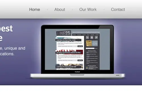
Emphasise this focal point with a radial gradient emitting from behind the laptop. This adds that little extra detail that lifts the element from the page.
Underneath the main header, draw another selection and fill with a grey-white gradient.
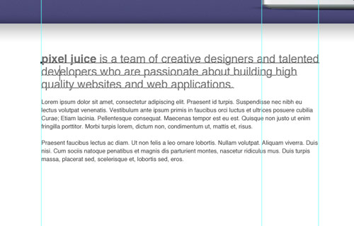
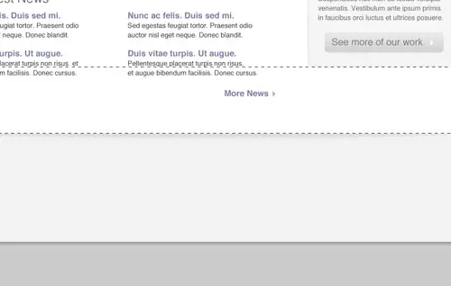
Split the mid section of the page into two columns with guides in relation to the grid lines. On the left we’ll have a main content panel, whereas the right will hold a thinner sidebar. Use the Type tool to add some dummy content. Alter the sizing and leading to give digestible and easily readable passages of text.
Below this main content area could hold an area to display the latest blog posts. Split the column into another two columns and draw up a selection of example post entries. The title links should stand out to the user as something clickable, so change their colour to give a visual clue.
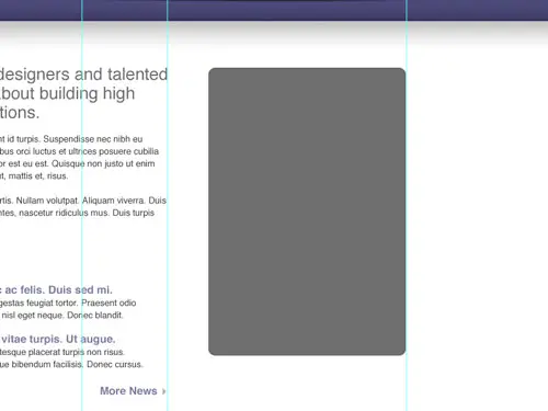
Use the Rounded Rectangle tool to draw a box in the sidebar. The original colour doesn’t matter too much as we’ll be styling it up in the next stage.
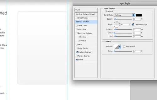
Double click the layer and add a range of layer styles, including a grey-white gradient, a thin grey stroke and a soft inner shadow.
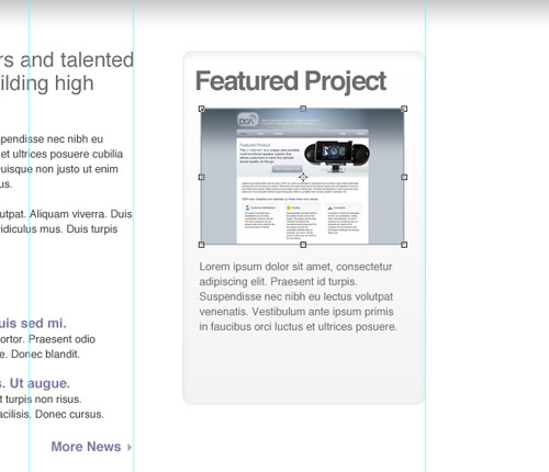
Use this sidebar panel to develop a Featured Project section. Elements could include a small screenshot and passage of text.
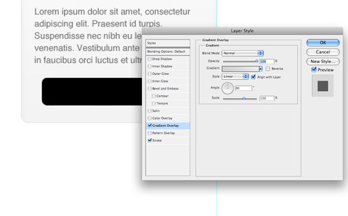
Draw another rounded rectangle to use as a button, add a couple of layer styles such as a gradient overlay and stroke to style the button to match the overall clean/grey theme.
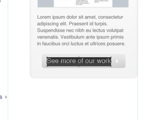
Create a short, descriptive label for the button prompting the user to continue through the site to view further projects.
Signify the end of the content by drawing a footer area onto the screen. Fill the area with a light grey to differentiate it from the main content area.
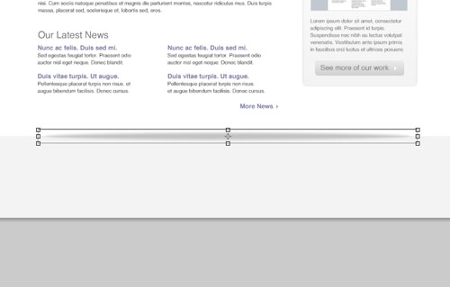
Draw a circular mask and fill it with a black to transparent radial gradient. Press CMD+T to transform the selection, squash and stretch the gradient to form a long thin shadow-like graphic.
Position the shadow centrally on the screen, then delete the excess area above the footer. The result is a subtle shadow that lifts the main page, adding a little touch of detail to the design.
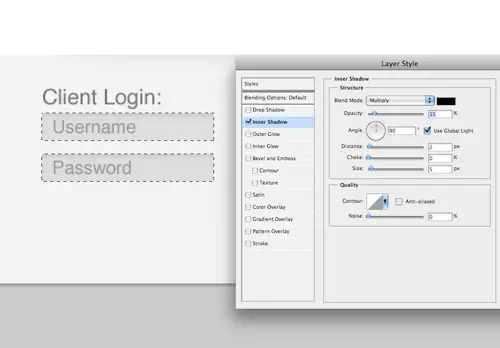
The footer area is a great place to hold secondary page elements, one example could be a client login area. Flesh out the design with the Type tool, then draw a couple of input boxes. Style the boxes with a soft inner shadow.
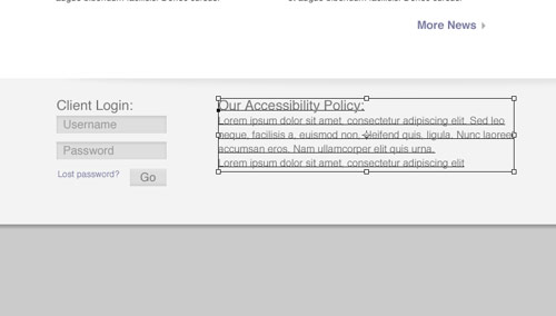
Use the central area of the footer to display a message about the company. Set the text using consistent header and body text font sizes.
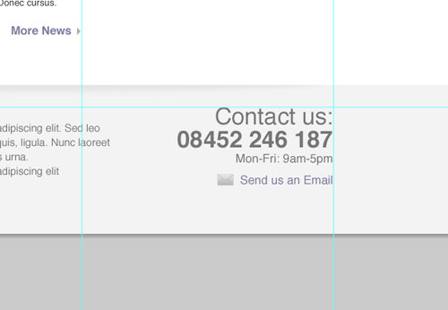
Finally, add a point of contact in the lower right. These details will then be handy to the user throughout the site. Give prominence to the most important aspects through size and stronger weights or colour.
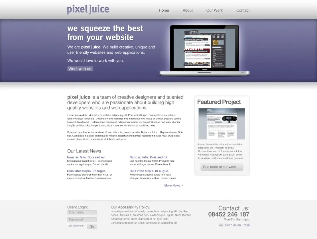
The final design fits all the desired elements neatly onto the page, while keeping everything aligned to the base grid. The result is a structured and clean layout with lots of subtle greys to add depth. Colour is then used to highlight feature areas and important content.
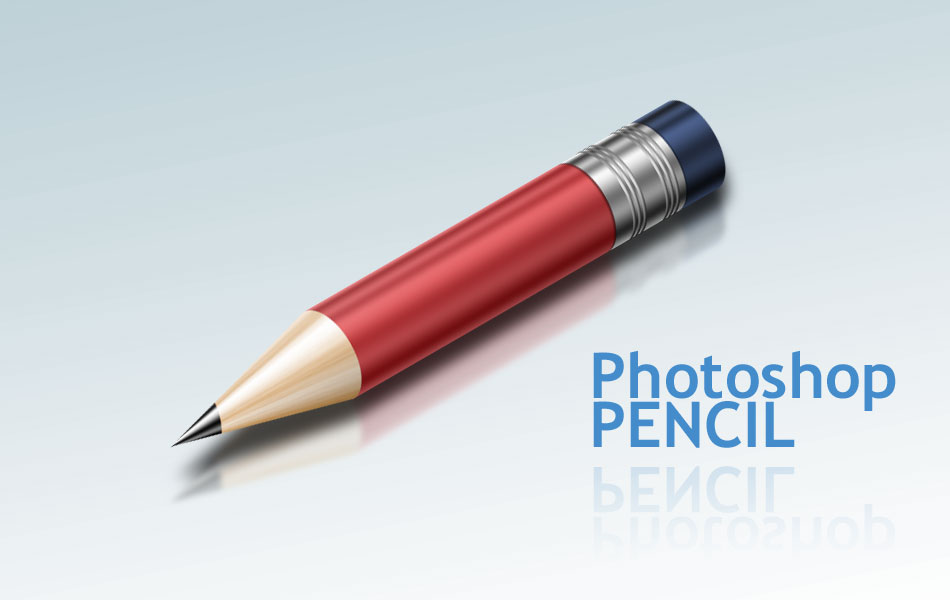
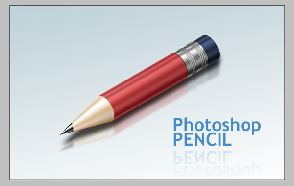
The Pencil is one of the visual metaphors most used to express creativity. In this tutorial, I’ll show you how to draw a pencil icon. We’ll have a look at gradients, selection tools, and basic transform operations. Let’s have some fun with this.
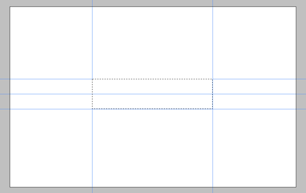
Create a New Document 950 pixels wide by 600 pixels heigh, set the Resolution to 300 pixels/inch, and the Background to white. Make a rectangular selection with a Style of Fixed Size, a Width of 400 px, and Height of 100 px.

Drag and snap guides to all edges and vertical center of the selection.
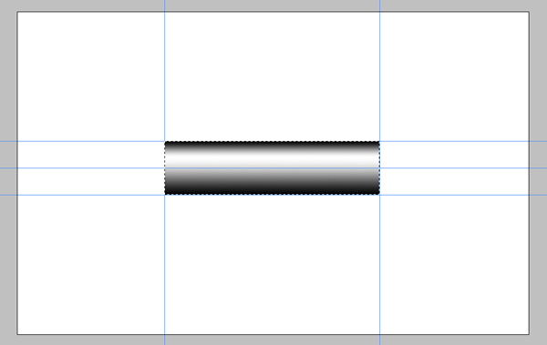
Open the gradient picker and select the "Steel Bar" preset from the drop down menu. If you can’t see the preset in the list, click the triangle button on the right and select "metals" from the list. Click Append. Create a new layer and name it "Body." Fill the selection with the gradient from bottom to the top of the selection.
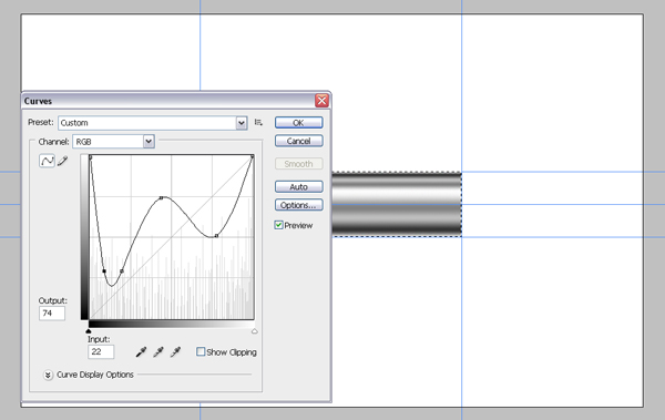
To make our pencil more reflective go to Image > Adjustments > Curves (Command + M), and adjust it as in the below image.
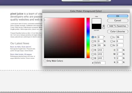
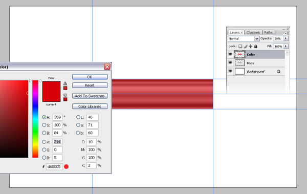
With the selection still active, create a new layer and fill the selection with the color #d60005, then set the layer Opacity to 60%. Name the new layer "Color."
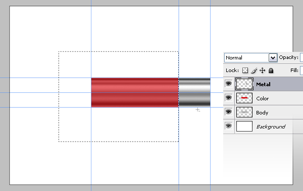
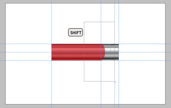
Right click the "Body" layer and duplicate it. Name it "Metal" and move it to the top of the layer stack. Select the Rectangular Marque Tool, set style to "normal," make a selection as in the image below, and hit Delete. Drag a guide from the left ruler and snap it to right edge of the selection.
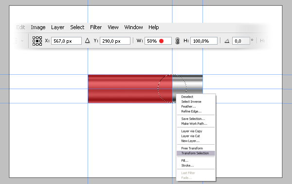
Select the Elliptical Marque tool and make a selection from point 1 in the image while holding down the Alt and Shift keys. Right-click inside the selection and choose Transform Selection, then set the Horizontal Scale to 50%, and hit Enter twice to apply. Hit Delete to delete the selected area. This will give our pencil a perspective look.
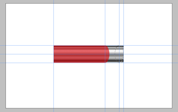
It’s a good idea to save it because we will need this selection later. Go to Select > Save Selection. Name the selection "Ellipse."
With the Marque tool still selected, drag the selection towards the right edge of the "Metal" layer. Drag another vertical guide until it snaps to the center of the selection.
Pick the Rectangular Marque tool, then while holding down the Shift key, make a selection as shown below. Go to Select > Inverse and hit Delete.
While holding down the Command key, click the "Metal" layer to load the selection (Click on the thumbnail of the layer, not on the layer name). With any selection tool selected, move the selection 4 pixels right. You can do it by pressing the Right Arrow on the keyboard 4 times.
Go to Select > Inverse. While holding down the Command + Alt + Shift keys, click on the "Metal" layer. Alt + Shift combination is for intersecting the already selected area and the new selection that we’re going to make. The new selection is the metal part because we’re holding down the Command key as well. So the metal part and our current selection will be intersected. Using this selection make a thin line on the metal part selected. Use these lines to make the bumps.

Copy and paste the selection into a new layer and name it "Bump." Apply a Gradient Overlay and Bevel and Emboss with these settings. To make it slightly bigger than the metal layer, hit Command + T, and set the Vertical Scale to 102%.

Duplicate the "Bump" layer and move the copy 6 pixels to the right. Repeat this step once more to make a total of 3 bumps. Select these 3 layers and merge them (Command + E.) Duplicate the merged layer to create another set of bumps and place it as you like.

Duplicate the "Metal" layer and name the copy "Eraser". Drag the "Eraser" layer below the "Metal" layer. Move the "Eraser" layer about 60 pixels right. Go to Image > Adjustments > Hue/Saturation (Command + U.) See the image below for the Hue/Saturation settings.
Duplicate the "Metal" layer again and name the copy "Shadow." Drag the "Shadow" layer below the "Metal" layer. Hit Command + U and bring the lightness to -100. Go to Filter > Blur > Motion Blur. Set the Angle to 0 and Distance to 5, then apply it. Now we can merge the layers related to the metal part of the pencil. Choose "Shadow," "Metal," and Bump layers, then Hit Command + E to merge them.

Create a new layer and name it "Tip." Using the Polygonal Lasso tool make a selection, as in the image below. Fill the selection with a light yellow orange. Move this layer down below the "Body." Go to Select > Deselect to loose the selection (Command + D).

Select and Duplicate the "Body". Name the new layer "TipGradient." Move this layer to the top. Hit Command + T, then set the scale and position as in the below image. Hit Command + U to bring up the Hue/Saturation dialog box and use these settings: Hue set to 33, Saturation set to 53, Lightness set to +37, and Colorize Checked.

Drag "TipGradient" layer down below the "Body" layer. Hold down Alt and click between the "TipGradient" and "Tip" layers.

With "TipGradient" layer selected, go to Edit > Transform > Perspective and adjust the perspective like this.

Go to Select > Load Selection, and load the selection "Ellipse." Position the selection as in the image, then Delete the selected area from both the "Body" and "Color" layers.

With the "Color" layer selected, create a new layer and name it "Wood." Press D on the keyboard to change the Foreground and Background colors to black and white. Press X to make foreground white. Fill the selection with white. Then go to Filter > Render > Fibers. Use 10 for both variables. Hit Command + T, rotate it 90 degrees counter clockwise, and scale it as shown below.

Go to Edit > Transform > Perspective and adjust the perspective as shown. Set the Blending Mode to Soft Light and Opacity to 60%.

Get the Elliptical Marque tool and make a selection, as shown below. Select the "Wood" layer and hit delete. Select the "TipGradient" layer and hit Command + U, then set the Saturation to -100. Hit Command + L and apply these settings. This will make the tip darker and high contrast.

Now we’re about to finish. Select all the layers except the "Background" layer and Hit Command + E to merge them. Rename the layer as "Pencil." Duplicate the "Pencil" layer and name it "Reflection." Drag the "Reflection" layer below the "Pencil" layer.
Duplicate the "Reflection" layer again, and name it "Shadow." With the "Shadow" layer selected hit Command + U and set the Lightness to -90. Hit Command + T and scale it to three-fourths of its height. Choose the "Reflection" layer, then go to Edit > Transform > Flip Vertical.

With all layers selected except the "Background" layer, hit Command + T, and rotate them -30 degrees. Move the "Shadow" and "Reflection" layers as shown below.

Choose the "Reflection" layer and go to Filter > Blur > Gaussian Blur. Apply it with a Radius of 3 and set the Opacity to 60. Choose the "Shadow" layer, then go to Filter > Blur > Gaussian Blur. Apply it with a Radius of 7 and set the Opacity to 80.
With the "Reflection" layer selected, add a Layer Mask using the Add Layer Mask button, which is located at the bottom of the Layer Palette. Fill the mask with the Gradient tool, from white to black, which makes the shadow vanish.

With the "Pencil" layer selected, apply a Gradient Overlay with these settings.

That’s it! You can change the position and also change the background color if you wish.